Community Spotlight: Ionic Theme iOS 27

Masahiko Sakakibara is a member of the Ionic community, a recognized Ionic Developer Expert, and an organizer of the Ionic Japan User Group. Masahiko has also contributed substantially to the Ionic community through his work translating the documentation for Ionic Framework, Stencil, and Capacitor for the Japanese community.
I’ve released v1.0.0 of @rdlabo/ionic-theme-ios27, a theme that brings iOS 27 design and motion to Ionic apps. It lets you build interfaces with Liquid Glass using familiar components such as ion-toolbar and ion-tab-bar.
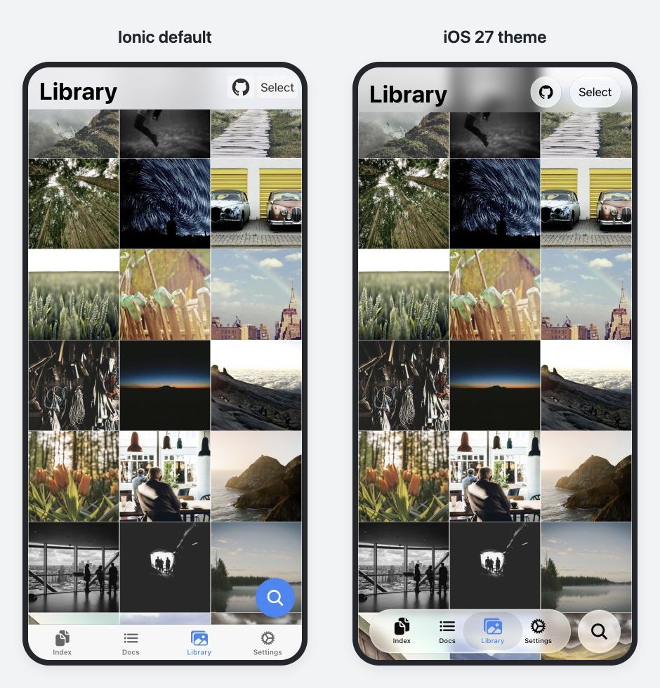
With the theme applied, the photos show through the toolbar, and the tab bar floats above the bottom of the screen. Both versions use the same Ionic components.
Start by opening the Library screen in the demo and trying the scrolling and tab interactions. This article walks through the theme changes and how to bring it into an existing app.
iOS 27 Design and Motion with Familiar Ionic Markup
Lists and buttons still use the familiar ion-list, ion-item, and ion-button components. There’s no need to replace them with components specific to the theme.
On the Settings screen below, the theme adjusts list corner radii and spacing, text sizes, and the shapes of buttons and search bars. It supports both light and dark modes.
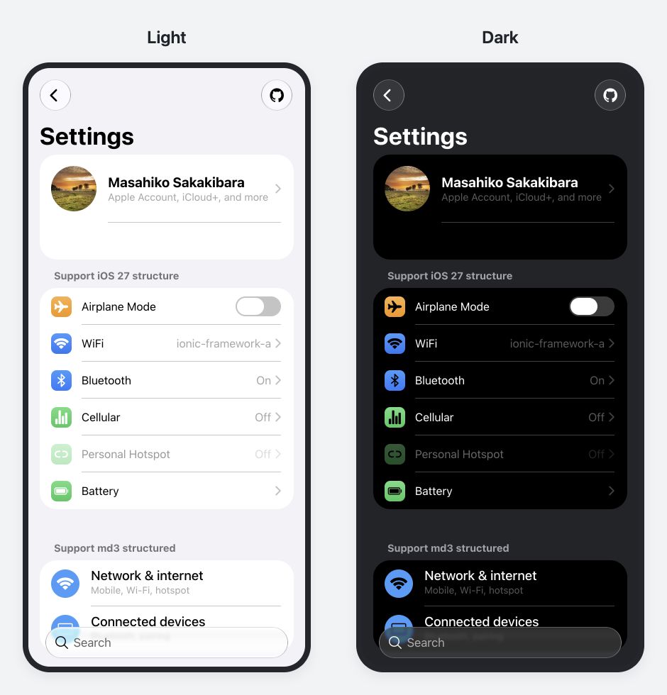
Compare the backgrounds, text, dividers, and glass effects.
The markup for a list looks like this:
<ion-list inset="true">
  <ion-item-group>
    <ion-item><ion-label>Notifications</ion-label></ion-item>
    <ion-item><ion-label>Appearance</ion-label></ion-item>
  </ion-item-group>
</ion-list>
With the theme applied in ios mode, this list takes on iOS 27 corner radii and spacing. Some markup needs to follow the structure the theme expects, such as wrapping items in an ion-item-group. The guide covers those requirements.
The theme also includes animations that respond to interaction. For example, with the additional tab effect enabled, pressing and dragging the selected tab makes a selection indicator shaped like a glass lens follow your finger. You can also try the spring motion when pressing buttons and the page transition animations in the demo.
Ionic components continue to handle selection state, keyboard interaction, and events when these effects are enabled. The additional tab and segment effects also respect the user’s reduced motion preference.
Separating Design Changes from Ionic Framework Updates
Many apps use Ionic’s default theme as the foundation for their own styling. If that foundation’s spacing and component shapes changed substantially with every OS redesign, it could break existing app designs. Apps with their own visual identity may have no need to follow the OS’s appearance in the first place.
This applies even within the same design direction of Liquid Glass. iOS 26 emphasized clear glass and soft edges, while iOS 27 adds darkened edges and stronger specular highlights for a stronger sense of depth. Component motion also differs. Continually replacing a single theme to match the latest OS would mean every theme update pushes substantial design changes into existing apps.
That’s why the iOS 26 and iOS 27 designs are available as separate themes, outside of the Ionic Framework, so teams can update the framework without also moving their app to a new generation of design. An app using the iOS 26 theme can evaluate and test the move to the iOS 27 theme as a separate change.
After applying a theme, you can still adapt it to your app using CSS variables or Sass, or load styles only for the components you need.
Resolving Styling Limitations with the Ionic Team
While building the theme, I ran into areas that couldn’t be adjusted with CSS alone. Some Ionic components encapsulate their internal structure and styles in Shadow DOM. If the element you want to style isn’t exposed through Shadow Parts or CSS custom properties, the theme may have no way to make the necessary adjustments.
I shared the designs I wanted to achieve and the limitations of the existing APIs with the Ionic team, who were happy to help. Adding the Shadow Parts and CSS custom properties I needed expanded what the theme could do.
The Ionic 8.8 release post also describes enhancements supporting community themes for Liquid Glass and Material Design 3.
Try It in an Existing App
The Web theme supports Ionic 8 starting with 8.8.1, as well as Ionic 9, and works with Angular, React, and Vue. You can adopt the theme and migrate to Ionic 9 on separate schedules. An Ionic 8 demo runs the same app.
Setup consists of installing the packages, loading the styles, and configuring animations as needed. The recommended setup uses both the iOS 26 and iOS 27 themes.
npm install @rdlabo/ionic-theme-ios26 @rdlabo/ionic-theme-ios27
Next, load the styles in your global Sass stylesheet. The recommended setup selects the iOS 26 or iOS 27 styles based on the CSS features the browser supports. These checks detect browser capabilities rather than the OS version. Browsers that meet neither condition retain Ionic’s default iOS appearance.
The setup guide includes the stylesheet imports, dark mode configuration, and animation options to pass when initializing Ionic. You can start with just the CSS to try the appearance. The guide also covers a setup that uses only the iOS 27 theme.
To preview the theme in a desktop browser, set mode: 'ios' in your Ionic initialization configuration. Also check the appearance and interactions on a real iOS device.
If you’re already using the iOS 26 theme, the migration guide details the changes to classes and CSS variables.
An Optional Feature That Projects Ionic UI into Native UI
For Capacitor iOS apps, I’ve also introduced Native UI Shell, an experimental feature that projects UI defined in Ionic into native UI.
It reads supported fixed controls, such as toolbar buttons and tab bars, from Ionic markup and displays them as native UIKit controls using Liquid Glass. Text, icons, and selection state stay in sync, and actions on the native controls flow back to the original Ionic components. Page content, scrolling, and routing remain in the WebView.
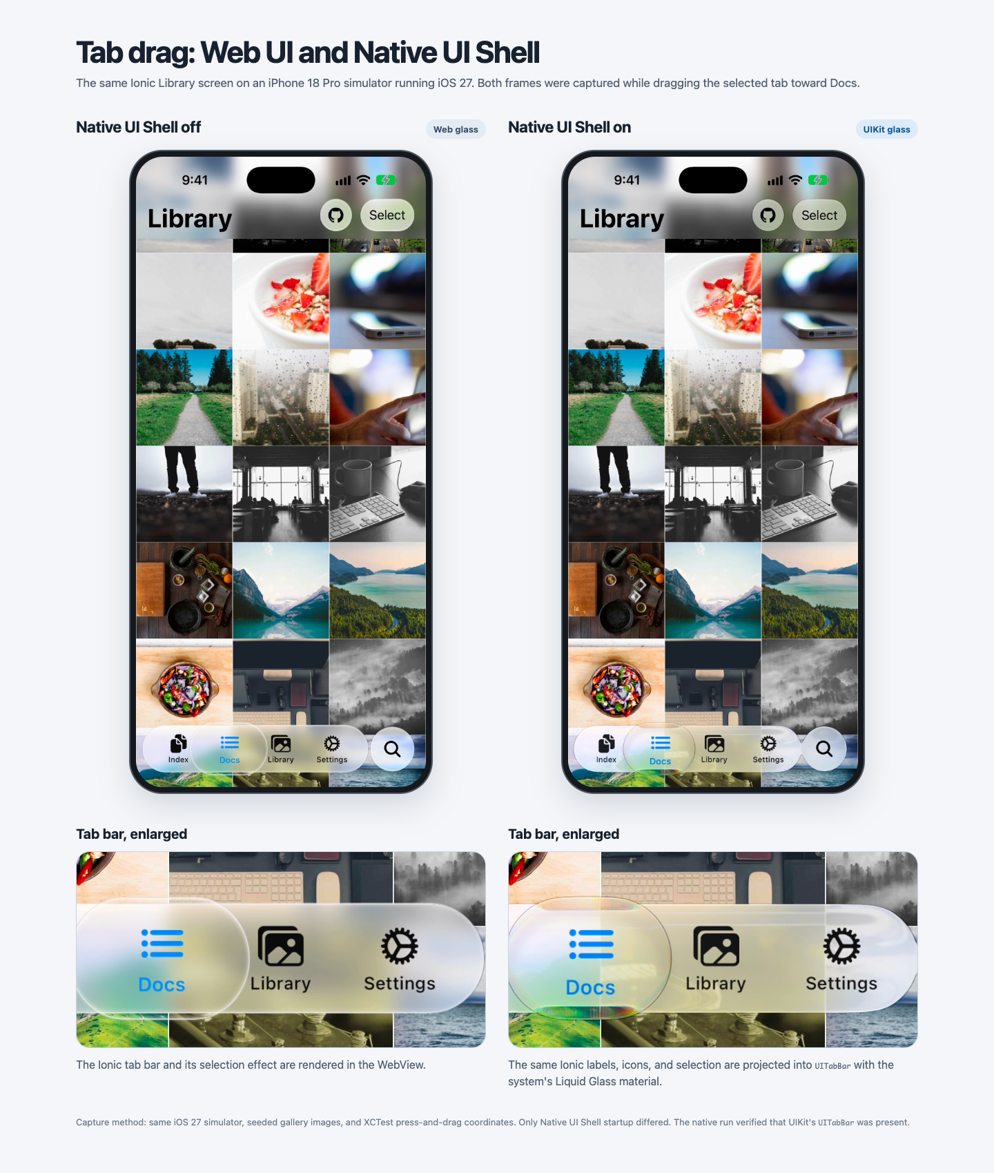
The Web theme and Web animations are stable in v1.0.0. Native UI Shell is an opt-in experimental feature, and its API and supported controls may change. Unsupported layouts retain their Web presentation.
The detailed Native UI Shell guide explains how it works, the design decisions behind it, the supported UI, and the setup process. If this approach interests you, I encourage you to read it.
Let’s Get Started
Start by applying the theme and trying a screen from your app in your development environment. The setup guide has the configuration you need to explore the appearance and interactions.
You can also combine it with @rdlabo/ionic-theme-md3 to apply iOS 27 design in ios mode and Material Design 3 in md mode.
If you find issues with component combinations or app styles that differ from the demo, please share them through GitHub Issues. Feedback from real apps helps guide the next improvements.
Bring iOS 27 design and motion to your app with the Ionic components you already know. If this design feels like a good fit for your app, I’d love for you to give it a try.
To follow Masahiko and the work he does for the Japanese Ionic community, be sure to check out his X!
Have a good story to share with the community? Get in touch, and we’d love to feature it in a spotlight post.