Layout the Cool Way: Using the Ionic 2 Grid Component

One of the first things a lot of developers love about Ionic is that it makes the tedious task of building basic app components that Just Look Good much easier. But did you know Ionic also has a grid component that makes layout easy? This is awesome because, well, CSS is a pain, and why deal with it if you don’t have to?
Take the photo gallery example app we built in a previous blog post. This app uses Ionic Native’s Image Picker plugin, which allows the user to select multiple photos from their native photo app, then displays the selected photos in a nice gallery layout, like this:


Sure, this is just a relatively simple two-column layout, but even if you’re a seasoned CSS master, you’d probably rather not deal with writing the styles for from scratch. And why would you? As developers, we excel at taking shortcuts implementing great tooling to help speed up our jobs, and in this case the good news is that Ionic 2, sprinkled with a little Angular 2, makes this a pretty simple, declarative process.
Getting Set Up
Want to follow along? Start by doing the following:
- Download the starter project from GitHub.
- Run
npm installin the project directory. - Run
ionic plugin add cordova-plugin-image-pickerin the project directory to install the Ionic Native Image Picker plugin.
Since this example uses the photo picker app from a previous post, you’ll also need to run the app on a device with the usual ionic run ios, ionic run android, Ionic View, or Ionic Package.
Now, we can get straight to it. The only additional thing we’re going to implement in this app is the grid component, so we don’t need to import any additional dependencies into our project.
Building the Grid
To start, we drop the following into <ion-content> in our app/pages/gallery/gallery.html template file:
<ion-grid>
  <ion-row *ngFor="let row of grid">
  </ion-row>
</ion-grid>
Similar to the popular Bootstrap UI framework for web development, Ionic’s grid component handles the layout of our app view as a set of columns and rows. In this case, <ion-grid> is an Ionic 2 component available out of the box that places the container for a grid layout in the DOM. Inside the grid, we have a series of rows declared with the <ion-row> component.
For this view, we want multiple rows, so we use Angular 2’s structural *ngFor directive, which will insert an <ion-row> for each value in an iterable we provide. In this case, the iterable is a grid array:
<ion-row *ngFor="let row of grid">
To make this work, we need to define the array in app/pages/gallery/gallery.ts. In this file, you’ll see that I’ve already included the code needed to get the array of file URIs that are passed in from the previous view by using Ionic’s NavParams.get():
images: Array<string>;

constructor(public navCtrl: NavController, public navParams: NavParams) {
  this.images = this.navParams.get('images'); //get file URIs
}
Conceptually, what we want to do next is declare an array where each index represents a row that contains a nested array of the file URIs for the images we want to display in that row. That sounds a little confusing, so think of it this way: We’re just modeling our array to look the way we want the final grid to look–the outer array models the grid, while the inner array models rows in the grid. The grid array will look like this:
[[file_uri, file_uri], [file_uri, file_uri], [file_uri, file_uri], ...]
To do this, we start by declaring a grid array in gallery.ts above the class constructor. Notice how our TypeScript declaration is declaring an array (our grid) that contains nested arrays of strings (our rows):
images: Array<string>;
grid: Array<Array<string>>; //array of arrays
Next, in our constructor, we define the size of the array to be equal to the number of rows we want in our grid. Since the user can choose an arbitrary number of images, we need to do some simple math to get the number of rows we need:
constructor(public navCtrl: NavController, public navParams: NavParams) {
  this.images = this.navParams.get('images');
  this.grid = Array(Math.ceil(this.images.length/2)); //MATHS!
}
We want two images per row in our grid, so all we’ve done is divide the number of file URIs in this.images by 2, then used JavaScript’s Math.ceil() operator to make sure we round up in the event that the number of photos isn’t even. So, for example, if the user selects seven photos, we create four rows.
Then, we just need to insert two images per row. We’ll do this as soon as the GalleryPage component is ready to load, by running our logic in IonViewLoaded(). For those not familiar with lifecycle events in Ionic 2, ionViewLoaded() is called when the component, in this case the Home page, first loads. We call our logic here, so that it runs before the view appears.
ionViewLoaded() {

  let rowNum = 0; //counter to iterate over the rows in the grid

  for (let i = 0; i < this.images.length; i+=2) { //iterate images

    this.grid[rowNum] = Array(2); //declare two elements per row

    if (this.images[i]) { //check file URI exists
      this.grid[rowNum][0] = this.images[i] //insert image
    }

    if (this.images[i+1]) { //repeat for the second image
      this.grid[rowNum][1] = this.images[i+1]
    }

    rowNum++; //go on to the next row
  }

}
We now have an array that models our grid, so all we have to do is add columns to the rows in our template. For this, we again use *ngFor, this time to add an <ion-col> for each of the photos in each row. Here, the *ngFor in our <ion-row> iterates over each row in the grid array; then, the *ngFor in each <ion-col> iterates over the file URI strings in that row and sets each as the src attribute for an <img> tag. We’ll also use the built-in width-50 attribute of <ion-col>. This tells Ionic to automatically size the column to be 50% the width of the grid, taking into account gutter width (the fancy spacing between columns):
<ion-grid>
  <ion-row *ngFor="let row of grid">
    <ion-col width-50 *ngFor="let file_uri of row">
      <img [src]="file_uri">
    </ion-col>
  </ion-row>
</ion-grid>
And there we go. A beautiful grid that will render as expected across iOS, Android, and Windows Phone, without a drop of CSS.
Is That All it Does?
Not by a long shot, friend!
OK, declaratively building a two-column, symmetrical grid layout for an image gallery is neat and all, but it’s pretty basic, all things considered. Not to worry! The grid, row and column components in Ionic 2 support a variety of attributes to help you build complex layouts that render consistently across platforms and devices, including specialized attributes for declaring offsets, widths, vertical alignment, and text wrapping.
For example, here’s our same gallery made inmo a simple profile page:


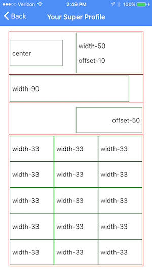
And just to show you how much is actually going on in this layout, here’s a view of the grid and grid attributes that actually handles the layout, with rows in red and columns in green:


That’s potentially a lot of CSS we would have had to write, and we get to handle it all declaratively, using grid attributes. That’s pretty swank, if you ask me.
You might have noticed in this layout that the gallery is a single row. What gives? Just for the sake of example, I assigned the wrap attribute to the <ion-row> element, which causes all of the columns it contains to wrap. This completely removes the need for all that array building we did before, and simplifies our template for the image gallery to this:
<ion-row wrap>
  <ion-col width-33 *ngFor="let file_uri of images">
  <img [src]="file_uri">
  </ion-col>
</ion-row>
So, why didn’t we take the easy route when we built the two-column gallery? We could have, but that wouldn’t have been nearly as much fun as working with nested arrays!
All kidding aside, the point is that there are almost always multiple ways to accomplish the same result, especially when it comes to building the layout of your app. Despite being simple to use, Ionic’s grid component provides a lot of flexibility, so give it a shot. If you’ve never worked with a grid layout before, you might be surprised at just how much of a headache it can save you in the long run.
For more information on the grid component, check out the Ionic 2 Grid docs, and in case you want to see the finished Image Picker sample app in all its gridded glory, you can download or fork it on GitHub. The starter for this project is available in the ‘grid-starter’ branch, and the profile view is available in the ‘grid-profile’ branch.


