Advanced Stencil Component Styling
No matter what kind of component you’re building, every component needs styles. In this tutorial, we’re going to take a deep dive into styling components using Stencil. We’ll learn how to implement global styles in Stencil, which helps us keep our components visually consistent when building a design system. We’ll also cover a lot of exciting CSS topics like gradients, animations, pseudo-elements, and more — so if that sounds interesting to you, let’s jump on in!
You can find all of the code for this tutorial at the Stencil CSS Github repository here.
NOTE: This tutorial assumes that you have a fundamental understanding of building components in Stencil. This tutorial will emphasize the CSS related aspects of building a component in Stencil.
Creating Our Stencil Component
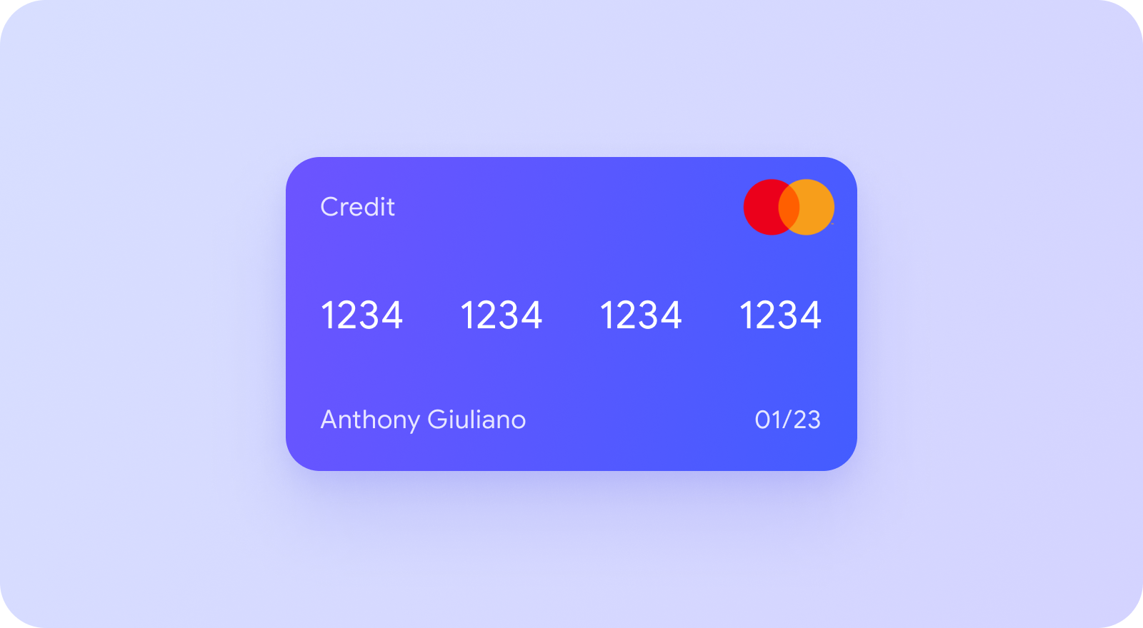
To illustrate all of these CSS topics, we’re going to be building a credit card component. This kind of component could be used to display a user’s stored credit cards, or can even be modified to serve as a fun way to input credit card information. Here’s what the final component will look like.
Speaking of the final component, let’s take a look at what the final component will look like when used in HTML:
<credit-card
  card-number="1234 1234 1234 1234"
  card-holder="Anthony Giuliano"
  expiration-date="01/22"
  cvv="123"
  gradient="purple"
></credit-card>
As you can see, our credit card component is going to have five properties. The first four props, card-number, card-holder, expiration-date, and cvv, are all aspects of a credit card that vary from card to card. The final prop, gradient, will be used to specify which gradient background we want to use for the credit card. We’ll discuss in more detail how this will work later in the tutorial. Keeping this in mind, let’s create a new Stencil component and take in these values as props.
@Component({
  tag: 'credit-card',
  styleUrl: 'credit-card.css',
  shadow: true,
})
export class CreditCard {
  @Prop() cardNumber: string;
  @Prop() cardHolder: string;
  @Prop() expirationDate: string;
  @Prop() cvv: string;
  @Prop() gradient: 'purple' | 'green' | 'orange';
Because our component is largely presentational, we’ll take in all of these values as strings so we can display them on our credit card. Next, let’s write our JSX to create the structure of our credit card.
 render() {
    return (
      <Host>
        <a href="/" class="card-wrapper">
          <div class="front">
            <div class="row">
              <p>Credit</p>
              <img src="https://raw.githubusercontent.com/a-giuliano/credit-card-css/master/src/assets/mastercard.png" alt="logo" />
            </div>
            <div class="row">
              {this.cardNumber.split(' ').map(number => (
                <p class="card-number">{number}</p>
              ))}
            </div>
            <div class="row">
              <p class="cardholder">{this.cardHolder}</p>
              <p class="exp-date">{this.expirationDate}</p>
            </div>
          </div>
          <div class="back">
            <p>Security Code</p>
            <p class="cvv">{this.cvv}</p>
          </div>
        </a>
      </Host>
    );
  }
One thing to note here is that we are using the split method on the cardNumber to display the cardNumber in groups of four digits. Because we use a space (‘ ‘) as our delimiter, the cardNumber has to be set with a space after every four digits. The rest of the JSX just displays the values we took as props in an organized way. With our props and jsx set, we’re ready to get into the fun part…styling!
Global Styles
When building out a design system, we want most of our styles to be directly tied to our components. This ensures that our components are modular, which makes them easier to manage, debug, and scale. However, there are some styles that we want to share between our components in order to have a consistent look and feel across our design system. The styles you decide to share across components are entirely up to you, but usually they include things like colors, typography, spacing, etc. In order for us to share these styles across our design system, we need global styles. These global styles will be made available to all our components for consistency. Fortunately for us, Stencil has built in support for a global stylesheet. Here’s how we can create a global stylesheet:
- Create a new folder called
globalunder thesrcdirectory of your Stencil project - Create a new file called
global.cssin theglobalfolder you just created - In your
stencil.config.tsfile, specify the global style option
globalStyle: 'src/global/global.css' - In the head of your
index.htmlfile, add a link to your global stylesheet
<link rel="stylesheet" href="/build/{YOUR_PROJECT_NAME}.css" />. Be sure to replace{YOUR_PROJECT_NAME}with the name of your Stencil project.
Now our global styles are available for us to use! So now let’s open up global.css and add some styles.
@import url('https://fonts.googleapis.com/css2?family=Roboto:wght@300;400;700&display=swap');

html,
body {
  font-family: 'Roboto', sans-serif;
}

:root {
  --font-color: #fff;

  --purple-gradient: linear-gradient(to right bottom, #a460f8, #4c48ff);
  --green-gradient: linear-gradient(to right bottom, #20e3b2, #0bc2c2);
  --orange-gradient: linear-gradient(to right bottom, #f9b523, #ff4e50);
}
The first thing we are doing here is importing the “Roboto” font from Google fonts. With this font imported, we can use it across our entire design system by setting the font-family of our html and body. In addition, we are declaring a few CSS variables on the :root of our project. These variables are really useful for ensuring that all our components use the same values for their styling. In our case, we are creating some variables for our font color as well as some gradients that will serve as the background of our credit cards. This setup provides us a lot of flexibility for the future. In the event we want to tweak any of these gradients, we can change them in our global styles and the change will propagate to any component that references that variable.
Styling the Component
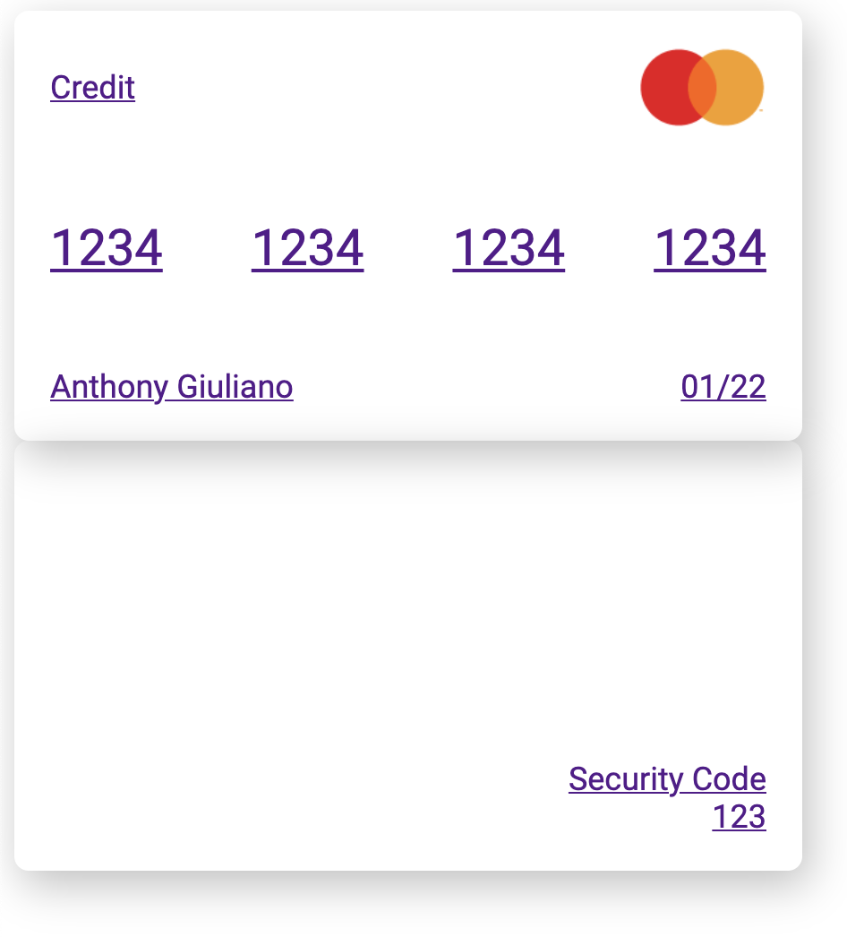
Alright, we’ve got our global styles and the structure of our credit card component. Let’s start styling the component itself. Within the Host element, our credit card is composed of three main parts: a front, a back, and a wrapper for these two sides. Our wrapper is an anchor tag with a class of card-wrapper. Let’s open credit-card.css and style this first.
.card-wrapper {
  display: block;
  width: fit-content;
}
Here, we are making the card a block-level element and fitting the width to its content (the front and back). Next, let’s style the front and back of the card. Naturally, the front and back will share a lot of styles, so let’s select both of them and specify the common styles.
.front,
.back {
  width: 400px;
  height: 200px;
  padding: 20px;
  border-radius: 8px;
  font-size: 1.125rem;
  display: flex;
  flex-direction: column;
  box-shadow: 4px 8px 24px rgba(0, 0, 0, 0.25);
}
Next, we can specify the styles unique to the front and back of the card. These styles are used to organize the layout of the content on each side of the card. Both sides already use flexbox and have set the direction to be columnwise, so now we can use justify-content and align-items to organize the children on each side. For the front, we’ll add space between the children, and for the back we’ll put the children in the bottom right corner.
.front {
  justify-content: space-between;
}

.back {
  justify-content: flex-end;
  align-items: flex-end;
}
Finally, we can add some small changes to our row class to put space between the elements in each row of the credit card. We will also increase the font size of the card number, remove margin and padding on <p> tags, and set a reasonable height for our image.
.row {
  display: flex;
  justify-content: space-between;
  align-items: center;
}

.card-number {
  font-size: 1.75rem;
}

p {
  margin: 0;
  padding: 0;
}

img {
  height: 45px;
}
With these styles, our component is starting to take shape. Here’s what it should look like so far:
Adding Gradients
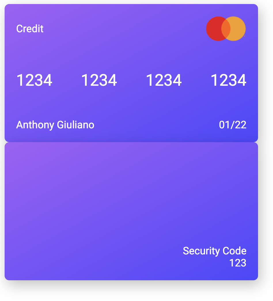
Now we get to make use of those fun gradients we set in our global styles! We’re going to let the user choose the gradient, but we want to make sure we limit them to the three gradients we defined. This is why, when we initialized our gradient prop, we set its type to be one of three specific strings.
@Prop() gradient: 'purple' | 'green' | 'orange';
We can make these three strings serve as class names, and in doing so, we can map background styles to each class.
.purple {
  background: var(--purple-gradient);
}

.green {
  background: var(--green-gradient);
}

.orange {
  background: var(--orange-gradient);
}
These classes won’t have any effect until we add the value of the gradient prop to the front and back of the card as a class using string interpolation.
<div class={`front ${this.gradient}`}>
  //child elements
</div>
<div class={`back ${this.gradient}`}>
  //child elements
</div>
Now we can pass in “purple”, “green”, or “orange” to our gradient prop to use whichever gradient background we prefer.
We also want to make use of our --font-color variable. Since we want our entire component to use this font color, we can set it on our card-wrapper. We can also remove the anchor tag’s default underline with text-decoration: none.
.card-wrapper {
  display: block;
  width: fit-content;
  color: var(--font-color);
  text-decoration: none;
}
Now our component is looking a bit more like our final result:
Make it Spin!
Our credit card component is looking good, but let’s liven it up a bit by adding some animation. In order for us to add animation to our component, there are a few CSS properties we will have to make use of. Let’s take a look at each of them and what they do.
transition– this property allows us to move, or transition, between two styles in a gradual and flowing way, as opposed to an abrupt change. It is actually a shorthand property that allows us to specify the transition property, duration, and more.transform– this property allows us to modify, or transform, an element by translating, scaling, rotating, or skewing it. We’ll use this property to rotate our card and we can do so with therotateY()function.rotateY()– this function is used to rotate an element around the Y axis. It takes a parameter that represents the angle of rotation.
backface-visibility– this property allows us to set whether or not the back of an element is visible when it faces the userperspective– perhaps the hardest to reason about, this property sets the distance between the screen and the user to create a 3D effect. It will make more sense when we see it in action.
With these properties in mind, the first thing we want to do is spin the card. To do that, we can use the transform property and the rotateY() function to turn the card 180 degrees. Because we only want to spin the card when we hover over it or focus on it, we’ll use the :hover and :focus pseudo-classes to specify that.
.card-wrapper:hover .front,
.card-wrapper:focus .front {
  transform: rotateY(180deg);
}
As a quick aside, we are using the
:focuspseudo-class in addition to:hoverfor accessibility purposes. Now, when a user focuses on the credit card element with a screen reader, the contents of the front and back of the card will be read aloud.
While this transformation does work, it has a few issues. First, the change is very abrupt. We can fix this by using the transition property. To use the transition property, we need to provide the property we want to animate and the duration of the animation. For our case, we want to create a transition for the transform property and we will give it a duration of 500 ms.
The second issue is that when the card rotates, the card contents become flipped around, as if we’re looking through the card from the back. While this has its use cases, we want to hide this side of the card when it turns. We can do this by using the backface-visibility property and setting it to hidden. These fixes will need to be made for both the front and the back of the card, so let’s add these changes where we target both the front and back class.
.front,
.back {
  width: 400px;
  height: 200px;
  padding: 20px;
  border-radius: 8px;
  font-size: 1.125rem;
  display: flex;
  flex-direction: column;
  box-shadow: 4px 8px 24px rgba(0, 0, 0, 0.25);
  transition: transform 500ms;
  backface-visibility: hidden;
}
Okay, the front of our card is animated. Now, let’s do the same to the back of the card. The back of the card should start out hidden, and rotate into view when we hover over the card. To do this, we can apply a transformation to rotate the card -180 degrees initially. A negative angle of rotation means the element will rotate counterclockwise. Because the backface-visibility is already set to hidden this rotation will make the back of the card invisible to start.
.back {
  justify-content: flex-end;
  align-items: flex-end;
  transform: rotateY(-180deg);
}
When we hover over the card or focus on it, the front rotates out of view. To rotate the back into view at the same time, we can rotate the back of the card back to 0 degrees.
.card-wrapper:hover .back,
.card-wrapper:focus .back {
  transform: rotateY(0deg);
}
Almost there! The back of our card rotates on hover and focus, but we still need to position it in the correct location. Up until now, the back of the card has sat under the front of the card, but we want it to sit behind the front of the card. To do this, we can use absolute positioning. If we set the card wrapper to have a position of relative, we can give the card back a position of absolute to position it relative to the card wrapper like so.
.card-wrapper {
  display: block;
  width: fit-content;
  color: var(--font-color);
  text-decoration: none;
  position: relative;
}

.back {
  position: absolute;
  top: 0;
  left: 0;
  justify-content: flex-end;
  align-items: flex-end;
  transform: rotateY(-180deg);
}
Finally, we need to set the perspective on our card wrapper to create a 3D effect. I’ve chosen a value of 3000px, which makes the effect fairly subtle, but feel free to play around with different values to see how the perspective property works. It becomes clearer the smaller the value.
.card-wrapper {
  display: block;
  width: fit-content;
  color: var(--font-color);
  text-decoration: none;
  position: relative;
  perspective: 3000px;
}
Final Touch
The last visual aspect of our credit card component is the magnetic strip. This is the black bar that runs across the back of the credit card. Because this element is purely decorative and doesn’t contain any content, we can build it using the ::before pseudo-element. ::before inserts content as the first child of the element we attach the selector to. This content, however, is not actually part of the DOM, making it a great tool for adding decorative content like this. To build the magnetic strip, we can add content as a child of the back of the card, and style it to look like a magnetic strip.
.back::before {
  content: '';
  display: block;
  position: absolute;
  top: 50px;
  left: 0;
  right: 0;
  width: 100%;
  height: 40px;
  background: rgba(0, 0, 0, 0.5);
}
And with that, our credit card component is complete! As you can see, there is so much you can do with CSS in Stencil, and this only scratches the surface of what’s possible. When it comes to building a design system, it is critically important to have components that are visually consistent. You can use these design elements to build other components that complement this one. I’d love to see what cool visual effects you have implemented in your Stencil components. Leave a comment below. I’m always excited to see what you build. 😀