Build your own App Router in Capacitor Apps with VanillaJS
This is a guest post from Simon Grimm, Ionic Developer Expert and educator at the Ionic Academy, an online school with 70+ video courses focused entirely on building awesome mobile apps with Ionic and Capacitor!
When building apps with Capacitor, you usually don’t worry a lot about routing as frameworks like Angular, React or Vue have their own routing solutions. But what if you simply want to build a great Capacitor app with VanillaJS?
In that case you have to roll your own routing logic, but spoiler: It’s actually not that hard!
In this tutorial, I’ll show you how to implement your own router for Capacitor apps with VanillaJS, and you can also find the full Capacitor VanillaJS routing code on Github.
Creating a Capacitor App
Since we are not using any framework in this tutorial, we can directly scaffold a basic Capacitor app through the command line:
npm init @capacitor/appAnswer the questions to give your app a name, then install all dependencies and immediately run your app on the browser:
npm install
npm run start
This should start a Vite development server and your app is served at http://localhost:3000/ with some basic elements.

Although we want the least amount of packages, TailwindCSS is one of the essential packages nowadays when it comes to styling and utility libraries, so let’s add this to our app.
However, note that this is not required to build our routing – it just makes our Capacitor app look awesome.
Adding TailwindCSS
You can style your web app with just CSS, but throwing in TailwindCSS makes it easy to have a great-looking app in minutes, still without committing to any JS framework.
To do so, simply install it as described:
npm install -D tailwindcss postcss autoprefixer
npx tailwindcss init
Now we just need to make sure we are including our files in the tailwind.config.js:
/** @type {import('tailwindcss').Config} */
module.exports = {
  content: ["./src/**/*.{html,js}"],
  theme: {
    extend: {},
  },
  plugins: [],
};
Additionally, we need to use PostCSS and have to create a new postcss.config.js at the root of our project with the following content:
module.exports = {
  plugins: {
    tailwindcss: {},
    autoprefixer: {},
  },
};
As a last step we need to load the Tailwind classes, so let’s add the following to our src/css/style.css:
/* Add Tailwind imports */
@tailwind base;
@tailwind components;
@tailwind utilities;
You can confirm that everything works correctly by adding some Tailwind utility classes to an element in your:
<h1 class="m-4 font-bold text-4xl underline">TEST</h1>This should result in a styled header element, and you should restart your live reload after all previous steps have been completed.

Now we are ready to use Capacitor with VanillaJS to create powerful native mobile apps with Tailwind styling!
Building a Capacitor App with Routing
By default, the Capacitor app has one Javascript file that defines a custom element with some styling and functionality.
As we want to build our own functionality from the ground up, let’s delete the src/js/capacitor-welcome.js and also all references to it inside the src/index.html.
Now let’s approach our Vanilla routing!
Routing in VanillaJS Apps
When it comes to routing in VanillaJS apps, there are many different approaches and libraries out there.
The most basic way is to use the History API to change the URL and listen to changes, but this is not very convenient.
Instead we will use a super slim package called Navigo that will give us some additional methods and ways to listen to changes.
If you are adventurous, feel free to try and build your own SPA router!
To get started, let’s install Navigo:
npm install navigoNow we can define our different routes and also the corresponding components that should be rendered with Navigo.
Creating a Simple Tab Bar
To use Navigo we need to set up a router instance and define our routes, and then use data-navigo attributes on our links to make them work.
Let’s start by creating a new src/js/router.js file and add the following code:
import Navigo from "navigo";
const router = new Navigo("/");
const render = (content) => (document.querySelector("#content").innerHTML = content);
router
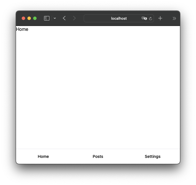
.on("/", (match) => {
render(`<div class="page"><h1>Home</h1></div>`);
})
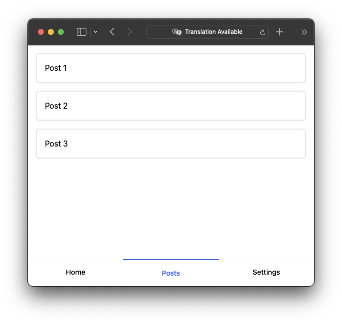
.on("/posts", (match) => {
render(`<div class="page"><div class="posts">
<a href="/posts/1" data-navigo>Post 1</a>
<a href="/posts/2" data-navigo>Post 2</a>
<a href="/posts/3" data-navigo>Post 3</a>
</div>
</div>`);
})
.on("/settings", (match) => {
render(`<div class="page"><h1>Settings</h1></div>`);
})
.resolve();This code will create a new Navigo router instance, and then define three routes for the home page, the posts page, and the settings page.
Additionally, we are using a render function that will simply set the inner HTML of our #content element to the content we pass in.
Finally, we are calling the resolve method to make sure that the current route is resolved and the correct content is rendered.This means that our actual content lives in one div and is simply swapped out when the URL changes. This basic approach works well for our use case.
You could make this more advanced by adding a templating engine like Handlebars or EJS to render the content from files, which is certainly required for more complex projects.
Now we can add the following code to our src/index.html to define some tabs and make them work with Navigo:
<body>
    <div class="flex flex-col min-h-screen">
      <div class="app-navbar-notch"></div>

      <div id="content" class="flex-1"></div>

      <div class="tab-bar">
        <nav class="flex" aria-label="Tabs">
          <a href="/" data-navigo class="tab">Home</a>
          <a href="/posts" data-navigo class="tab">Posts</a>
          <a href="/settings" data-navigo class="tab">Settings</a>
        </nav>
      </div>
    </div>

    <script src="./js/router.js" type="module"></script>
  </body>
At this point it won’t really look like tabs, so let’s sprinkle in some Tailwind styling through our src/css/style.css:
:root {
  --nav-bg: theme(colors.blue.600);
}

.tab-bar {
  @apply border-t border-gray-200 w-full fixed bottom-0;
}

.tab {
  @apply flex-1 flex justify-center whitespace-nowrap py-4 px-1 text-sm font-medium;
  margin-bottom: env(safe-area-inset-bottom);
}
This will give us a nice tab bar at the bottom of our app, and we can now navigate between the different pages.
But this is far from a real tab bar, so let’s add some additional functionality to make it more dynamic.
Tab Changes and Dynamic URLs
It’s not enough to render the content of a selected tab, we also want to show which tab is active. Additionally, let’s also add one more route to Navigo to show a single post based on an ID in the URL.
Therefore we can update our src/js/router.js to the following:
import Navigo from "navigo";

const router = new Navigo("/");
const body = document.querySelector("body");

const render = (content) => (document.querySelector("#content").innerHTML = content);

router
  .on("/", (match) => {
    body.dispatchEvent(new CustomEvent("page-changed", { detail: { page: "Home", tab: 0 } }));
    updateTabbar(0);
    render(`<div class="page"><h1>Home</h1></div>`);
  })
  .on("/posts", (match) => {
    body.dispatchEvent(new CustomEvent("page-changed", { detail: { page: "Posts", tab: 1 } }));
    updateTabbar(1);
    render(`<div class="page"><div class="posts">
    <a href="/posts/1" data-navigo>Post 1</a>
    <a href="/posts/2" data-navigo>Post 2</a>
    <a href="/posts/3" data-navigo>Post 3</a>
    </div>
  </div>`);
  })
  .on("/settings", (match) => {
    body.dispatchEvent(new CustomEvent("page-changed", { detail: { page: "Settings", tab: 2 } }));
    updateTabbar(2);
    render(`<div class="page"><h1>Settings</h1></div>`);
  })
  .on("/posts/:id", (match) => {
    console.log(match);
    const id = match.data.id;
    body.dispatchEvent(new CustomEvent("page-changed", { detail: { page: `Post ${id}`, tab: 1, back: true } }));
    updateTabbar(1);
    render(`<div class="page"><h1>POST DETAILS: ${id}</h1></div>`);
  })
  .resolve();

function updateTabbar(activeIndex) {
  const tabs = document.getElementsByClassName("tab");

  for (let i = 0; i < tabs.length; i++) {
    if (i === activeIndex) {
      tabs[i].classList.add("tab-active");
    } else {
      tabs[i].classList.remove("tab-active");
    }
  }
}
We basically enriched our routes with some additional functionality:
- We are now dispatching a page-changed event on the body element whenever a route is resolved. This event contains the name of the page and the index of the tab that should be active – we will use this soon to include a fancy additional navigation bar at the top of our app.
- We are also calling a new updateTabbar function that will update the tab bar CSS class based on the active index.
- We are also adding a new route for /posts/:id that will show a single post based on the ID in the URL. This route will also dispatch the page-changed event, but with a back property set to true. This will be used to show a back button in the tab bar.
Now that we are adding additional classes to the tabs, let’s define the styling for those in our src/css/style.css:
.tab-active {
  @apply border-t-2 border-blue-600 text-blue-600 flex-1 flex justify-center whitespace-nowrap py-4 px-1 text-sm font-medium;
}

.page {
  height: calc(100vh - 54px - 53px - env(safe-area-inset-top) - env(safe-area-inset-bottom));
  margin-top: env(safe-area-inset-top);
}

.posts {
  @apply p-4 flex flex-col gap-4;
}

.posts a {
  @apply border-gray-200 border-2 rounded-md p-4 flex flex-col gap-4 shadow-sm;
}
This will make the active tab look a bit different from the others, and we can already navigate to a details page and see the ID reflected in the component:
But real apps also have a navigation bar, and we can recreate this feature with VanillaJS as well.
Adding a Navigation Bar
The navigation bar is a common pattern in mobile apps, and it’s a great way to show the current page and provide a back button to the previous page in case we navigated from a list to a details page. The navigation bar should be at the top and show the title of the current active page, and needs to have an optional back button. As we already have the page-changed event, we can use this to update the navigation bar whenever the page changes!
We can create this component as a new web component, so let’s add a new file src/js/navbar.js and insert:
window.customElements.define(
  "custom-navbar",
  class extends HTMLElement {
    constructor() {
      super();
      const root = this.attachShadow({ mode: "open" });
      root.innerHTML = `
    <style>
      :host {
        position: relative;
        display: block;
        padding: 15px 15px 15px 15px;
        text-align: center;
        background-color: var(--nav-bg);
        position: fixed;
        width: 100%;
        top: env(safe-area-inset-top);
      }
      .nav {
        display: flex;
        flex-direction: row;
        gap: 10px;
      }
      h1 {
        margin: 0;
        font-size: 1em;
        font-weight: 700;
        color: #fff;
      }
      #back-btn {
        width: 24px;
        height: 24px;
        display: none;
        color: #fff;
        font-size: 1em;
        font-weight: 700;
        text-decoration: none;
      }
    </style>
    <div class="nav">
      <a id="back-btn">
      <svg xmlns="http://www.w3.org/2000/svg" class="ionicon" viewBox="0 0 512 512"><path fill="none" stroke="currentColor" stroke-linecap="round" stroke-linejoin="round" stroke-width="48" d="M328 112L184 256l144 144"/></svg>
      </a>
      <div><h1 id="nav-title"></h2></div>
    </div>
    `;
    }

    // Called on start
    connectedCallback() {
      const self = this;

      // Listen to our page change events
      const body = document.querySelector("body");
      const navTitle = self.shadowRoot.getElementById("nav-title");

      body.addEventListener("page-changed", (event) => {
        const title = event.detail.page;
        navTitle.innerHTML = title;

        const canGoBack = event.detail.back;
        if (canGoBack) {
          self.shadowRoot.getElementById("back-btn").style.display = "block";
        } else {
          self.shadowRoot.getElementById("back-btn").style.display = "none";
        }
      });

      const backBtn = self.shadowRoot.getElementById("back-btn");
      backBtn.addEventListener("click", (event) => {
        history.back();
      });
    }
  }
);
If you are not familiar with web components, this might look a bit strange, butit’s quite simple:
- We are defining a new web component called custom-navbar that extends the
HTMLElementclass. - We are using the
connectedCallbackmethod to listen to thepage-changedevent on the body element. Whenever this event is fired, we are updating the title of the navigation bar and showing or hiding the back button based on the back property of the event. - We are also listening to the click event on the back button and calling
history.back()to go back to the previous page. - We are using a
shadowRootto encapsulate the styling of the component.
You can also learn more about building Capacitor apps with VanillaJS in one of my previous tutorials.
Now that we have our component, let’s add it to our src/index.html and include a little fix from the previous tutorial to make the tab bar appear below the notch area:
<body>
    <div class="flex flex-col min-h-screen">
      <div class="app-navbar-notch"></div>
      <div style="height: 54px">
        <custom-navbar></custom-navbar>
      </div>

      <div id="content" class="flex-1"></div>

      <div class="tab-bar">
        <nav class="flex" aria-label="Tabs">
          <a href="/" data-navigo class="tab">Home</a>
          <a href="/posts" data-navigo class="tab">Posts</a>
          <a href="/settings" data-navigo class="tab">Settings</a>
        </nav>
      </div>
    </div>

    <script src="./js/navbar.js" type="module"></script>
    <script src="./js/router.js" type="module"></script>
  </body>
The code for the notch area fix needs to be added to our src/css/app.css:
/* Fix for iOS area above our custom nav bar */
.app-navbar-notch {
  position: fixed;
  top: 0;
  left: 0;
  right: 0;
  z-index: 99;
  height: env(safe-area-inset-top);
  @apply bg-blue-600;
}
With all of that in place, navigate around the tabs and see how the title changes – and also check out this beauty of a details page with custom navigation bar:

If you think this is a powerful native app, hold your praise – there’s one more thing we want to add!
Capacitor Deeplinks
As we have a list of posts and detailed pages, wouldn’t it be nice if we could directly open a page of our app from a link?
This is possible with deeplinks – and Capacitor has a plugin for that! Let’s install the plugin:
npm install @capacitor/appNow all we have to do in our code is to listen to the appUrlOpen event and navigate to the page that was opened.
We can split the URL by a specific URL scheme, which we later also need to set up for iOS and Android (it’s super easy), and then grab the right path to our post.
Go ahead by adding the following to our src/js/router.js:
import { App } from "@capacitor/app";

App.addListener("appUrlOpen", (event) => {
  const pathArray = event.url.split("capacitorvanilla://");
  if (pathArray.length > 1) {
    const url = pathArray.pop();
    router.navigate(url);
  }
});
To see that code in action we now need to move our Capacitor project to a native platform.
Adding Native Platforms
To get started, install the native platforms and run a build of your web project. Afterward we can add the platforms using the Capacitor CLI in our project:
npm install @capacitor/android @capacitor/ios
npm run build

npx cap add android
npx cap add ios
Now whenever you want to build a native app, you can simply build your web project and sync those changes into the native folders:
npm run build
npx cap sync
Next we need to add our URL scheme to the native platforms, so that they know how to open our app.
We start with iOS, for which we can edit the ios/App/App/Info.plist and add a new entry like this:
<key>CFBundleURLTypes</key>
	<array>
		<dict>
			<key>CFBundleURLName</key>
			<string>com.galaxies.routing</string>
			<key>CFBundleURLSchemes</key>
			<array>
				<string>capacitorvanilla</string>
			</array>
		</dict>
	</array>
This tells iOS that our app can be opened with the capacitorvanilla URL scheme.
For Android, we now need to edit the android/app/src/main/AndroidManifest.xml and add the following intent filter to the MainActivity:
<intent-filter>
  <action android:name="android.intent.action.VIEW" />
  <category android:name="android.intent.category.DEFAULT" />
  <category android:name="android.intent.category.BROWSABLE" />
  <data android:scheme="@string/custom_url_scheme" />
</intent-filter>
Additionally, we now need to add the custom_url_scheme to our android/app/src/main/res/values/strings.xml:
<string name="custom_url_scheme">capacitorvanilla</string>Now we can build our native apps and run them on a device or emulator:
npx cap run ios
npx cap run android
To check if this works, simply create a note somewhere on your phone and add the link capacitorvanilla://posts/1337 and open it. You should now see the details page of the post with the ID 1337!

Capacitor almost makes it too easy to build native apps, right?
Parting Thoughts
In this tutorial we have learned how to add routing to a Capacitor app with just VanillaJS and Navigo.
We also learned how to add deeplinks to our app, so that we can open specific pages from a link.
Finally, we made everything look nice with a custom navigation bar and Tailwind styling.
If you enjoyed this tutorial, check out how you can use Capacitor to build native iOS and Android apps with the web.